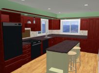
My New Blog: TF Workshop

Showing posts with label Design. Show all posts

Sunday, February 24, 2008

Resources #3 - NKBA.ORG

The National Kitchen and Bath Association web site has a number of good resources to help you plan your kitchen remodel.


They will send you a free workbook that has very good information on design guidelines. A summary of these, and additional information can be found at kitchens.com.

Sunday, November 25, 2007

Review #8 - Work Triangle / Island Layout

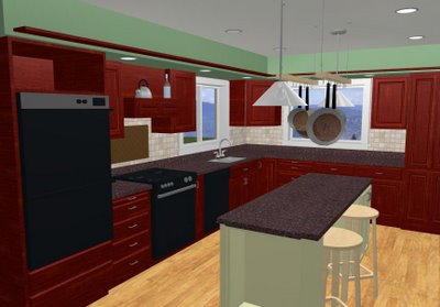
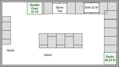
I am going to rate the overall layout and work-flow of our kitchen as a 4 (good choice, slight room for improvement). I did a review of it once it was in, but we have now lived with it for an additional 7 months. Here is the layout...


We now think the location of the fridge is great - not just good, even though it fall outside of what is considered an optimum work-triangle. Here is why:
  • The kids can get to it without interfering with people cooking
  • We easily set stuff on the island
  • You can sit at the island, watch TV and grab the milk without moving!
The space between te island and the fridge wall is OK. 36" has not been a problem at all. We can still sit at the island and have someone move behind us. Would 6 inches be better? Yes - but it's not a killer

42 inches between the island and the counter is great. I would not change this, even if I had the room to do so. The max I would want is 48 - any wider and it would not be easy to reach from one side to the other.

Island at 30" x 90" is great. It could be 36" wide, but no wider - too hard to reach across. The kids are able to sit and do homework at the island while my DW is working with no problems. Anything longer than 90" would make the trip around the island too long.

So if I design a new kitchen, it will be 12" wide - 24" for the counter, 42" isle, 36" island, 42" isle.

The pot rack over the island works really well. It provides a lot of storage, does not block cross-views, and looks nice.


More how-to detail in my article library on eHow...

Wednesday, October 03, 2007

Review #1 - Design Software - Must Have

As stated earlier: Now that the kitchen is complete, I am looking at what we did to see how it went. I hope to learn something from the experience I can apply to future projects.

Ratings:
5 - Would do it exactly the same way again
4 - Very good choice - maybe some slight room for improvement
3 - Good choice - some areas for improvement, but overall satisfied
2 - Not so good choice - should have done it differently
1 - Bad choice - what was I thinking?

Using design software: I am going to rate this a 5 (must do). The $100 and the time to learn how to use it were very well spent. Here are examples of the model vs the actual...


Having this was critical to seeing if our plan was going to look the way we wanted it to. Sketches are one thing, but a model that you can drive around and look at is a big advantage.
Downsides: It takes a bit of time to learn how to use it to the extent your can create a full model, and it takes a while to do the full model. This being said, it takes a lot longer to rip out your work when you and your DW had a different idea of it was going to look like.

Friday, August 10, 2007

Added a Ceiling Beam

I installed the wooden ceiling beam this evening. No distasters, in fact, the whole thing took about an hour and a half, and turned out well.

The goal of putting the beam in was to create a simple visual boundary between the kitchen and the dining area, and break up the ceiling. It also makes the kitchen feel a bit more rustic.


How to installed beam:
  • Mark the ceiling and drill holes for the lag bolts (7 inch long) - I used six to hold the beam. These go into the 2x4 truss above ceiling
  • Cut the beam 1/4 inch longer than the space it needs to go into
  • Cut a hole in one wall the size of the beam
  • Lift the beam, slide it into the hole, bring it up into place, and slide it solid against the other wall.
  • Use upright 2x4's on each end (with some small peices of wood for protection) of the beam to hold it into place.
  • Lag bolt the beam from above
  • Drill and lag bolt the end of the beam that is not in the hole (picture below)

The bolt will be covered by the crown molding.

The other end sits in hole and "floats". This allows for the beam to expand and contract without pulling away from the wall and leaving a gap. Since I bought "green" douglas fir, I expect a slight shrinkage.

The cost of the 10ft beam and lag bolts $20.

Saturday, July 28, 2007

Adding a Ceiling Beam to the Kitchen Plan

I have decided to add a ceiling beam across the front of the kitchen. Here is the 3D model showing how it will look.

If our ceiling height was 9 feet instead of 8, I would do a more extensive layout. Things being what they are, I am going with a single beam.

Reasons for doing it:
  • It helps define the "boundary" of the kitchen. I think having this definition improves the overall design, without closing anything in. I also ties the soffit in
  • It adds a bit of a rustic feeling, which is what we are looking for: rustic feeling, high quailty workmanship.
  • Its not expensive to do. I will fabricate a hollow beam out of #1 pine and mount it to a ledger piece screwed through the ceiling to the truss. I estimate $40 or less.

Sunday, April 15, 2007

Post Mortem on the Kitchen Layout

At work, a post-mortem (literally: after death) is where we review what has been done and decide if the results are good. We also discuss what could have been done better. I get a number of searches leading to this blog about kitchen layout, so I thought I would do a similar follow-up. [Link to original post]

Here is the layout. I have numbered and rated the "zones" of the plan


Rating 1: Great - Main working area

  • 42" inches seems almost perfect.

  • It gives plenty of room for a person to work, plus allow other to circulate - or have two people work.

  • It allows easy movement no matter which appliacnce is open

  • A few inches more would be fine, but much more than that would make the island too far from the counter for easy use. If I had the extra space I wold have applied it elsewhere.

Rating 2: Great - End working area

  • Same as rating one for basically the same reasons.

  • The area by the sink and dishwasher is nice and open, so two people can unload, rinse, load, wash, etc.

  • Also, the cabinets in this area have deep pull-out shelves. There is plenty of space to have them out and still stand in front of them.

  • The pantry cabinet doors can stay open if needed

Rating 3: Good - Island dimesions, design

  • 90 inches is a great length

  • 30 inches works fine. 32" to 36" would be an improvement. More than about 42" seems like it would make reaching across difficult. I would not want a 24" wide island - it would seem too narrow. 28" seems like it would be the minimum.

  • My DW can work at the island and it still gives the kids enough room to do homework, etc.

Rating 4: Good - Refridgerator Location / Work Triangle

  • Even though it is somewhat farther than NKBA suggests, it still works fine. The travel does not seem excessive.

  • We get stuff out and set it on the island.

  • The door swing works fine in the 36" space. We have a side-by-side. If you had a single door, it might not work so well.

  • We have 4 kids, who seem to get in and out of the fridge every 5 minutes. Having it a the front (dining room) end of the kitchen works well.

Rating 5: OK - Area on the far side of the island

  • 36" is what we have, and its the minimum I would want. Would I make the island narrower to get this a bit wider? No. Would I give up any of this to have a wider island? No. It is a compromise, but it works.

  • There is room for you to walk by - 24 inches - when people are sitting at the stools.

  • Since this side of the kitchen is the pantry wall, it works. I would not do 36" inches if there wree cabinets there.

  • Its amazing what going from 36" on one side to 42" on the other will do. 6" seems like yards!

  • Overall, I am happy with the decision to do it this way. In a perfect word, the wall would be 4 to 6 inches over.

Rating 6: Great - Stools on Island

  • My DW insisted (strongly) that there would be seating at the island. It was critical to her to have a place for people to sit and interact with her as she cooks. My initial response was "I guess that would be OK" - my response now is "this is great". It is a key feature of the kitchen. All you DH's out there, I got lucky and listended on this one...

  • We have a 12" overhang with square saddle stools, and it is almost perfect. There is plenty of leg room. Two cabinets needed to have the depth shortened to 16 inches from 24 - its worth it.

  • There is 50" width for two stools (NKBA recommends 24" per seat) - works great.

  • Room for three would have been nice, but the appliance lift on the other side of the island needed 22.5" inches.

Island cabinet plan


Summary: We would go with this plan again.


Thursday, April 12, 2007

On-line Cost Estimator

I found what I think is a useful tool on remodelingmyspace.com - its an online cost estimator. I took our kitchen floor plan and tested it, and it came up with $44,500. The initial cost estimate I came up with was about $50K using a couple of online sources, but they are generic. This tool allows you to specify your remodel with a modest level of detail.


Taking the $44K the estimator calcuated and adding in a full-wall tile backsplash, toe-kick drawers, pull-out shelves, tiole curtains, new windows, etc. - $50K seems pretty close to the mark.
I stumbled on to remodelingmyspace.com from the contest banner on another remodeling blog, and I now have it on mine (If I win anything, it goes to Compassion - see sidebar). I have not searched through the entire site yet, but what I have looked at seems to be good quality content.

Sunday, April 01, 2007

Comparing Current Work to Design Model

I realized I was taking a lot of detailed pictures of the kitchen, but not a of the whole room. For my own motivation, I like to compare acctual progress to the plan. Here is a picture of the model:


Here is the actual state of the kitchen. The area is a bit messy - we are in he misdt of painting, grouting, etc. All in all, I am pretty happy with the progress to plan.

The best part is my DW is getting close to having an improved cooking zone, although we have been eating well throughout the remodel.

Monday, March 26, 2007

Island Design - Traffic & Work Triangle

Here is a diagram of our kitchen island with the clearance dimensions (click on the picture for a larger view).


Our kitchen has enough floor space - 180 square feet, plus a good sized pantry & laundry right off of it - but it would have been great if it were 1 ft wider. Since it's 11 feet wide, we had to really think about how wide we wanted with island, and still allow for good traffic flow. There are two things that really helped us decide: The NKBA guidelines and mocking up the island to see if it would work.

On the oven side (the working side) of the island, we went with 42 inches. This allows for two people to pass easily if the oven or dishwasher doors are closed, and one to pass if they are open.

On the opposite side of the island, we went with the minium of 36 inches. We have seating for two on this side. When people are seated, you can walk behind them - you have about 24 inches clearance when someone is seated there. Six more inches would have been great, but this was the point of compromise.

This allowed us a 30 inch wide island. Again, if we could have 6 more inches on the island, it would be great - but 30 is workable. If I design a kitchen layout in the future, I will allow 12 feet minimum for the width...

As far as the work triangle goes, we were not able to follow all the design guidelines exactly. The fridge is a bit "out of the way" compared to their recommendations, bu it works fine. We get what we need out of it and set it on the island.

The total triangle should be 26 feet and ours is 29. No leg should be over 9 feet, and we have one that is 12. The distance from the sink to the fridge is the one that gets us. So far, it seems to be OK.

Here is a summary of the kitchen design guidelines for minimum clearances and traffic flow from NKBA.Org

  • Doorways should be at least 32 inches wide and not more than 24 inches deep. When two counters flank a doorway entry, the minimum 32-inch-wide clearance should be allowed from the point of one counter to the closest point of the counter on the opposite side.
    Walkways should be 36 inches wide.

  • Work aisles should be at least 42 inches wide in one-cook kitchens, at least 48 inches wide in multiple-cook kitchens.

  • The work triangle should be no more than 26 feet, with no single leg of the work triangle shorter than 4 feet nor longer than 9 feet.

  • If two or more people cook at the same time, a work triangle should be placed for each cook. One leg of the primary and secondary triangles may be shared, but the two should not cross one another.

  • No major traffic patterns should cross through the work triangle.

  • No entry, appliance, or cabinet doors should interfere with another. In a seating area, 36 inches of clearance should be allowed from the counter or table edge to any wall or obstruction behind it if no traffic will pass behind a seated diner. If there is a walkway behind the seating area, 65 inches of clearance, total, including the walkway, should be allowed between the seating area and any wall or obstruction.

Saturday, March 17, 2007

The Design Process between DW & DH

Someone posted a pretty insightful question yesterday: How does the design process work between you and your DW? There is no doubt there are many variations on this - here is our general approach...

I act as the overall designer. My DW focuses on function, details and color. I am an efficiency nut (engineering background). She is really in-tune with the people aspects. So, all in all, we make a good team. Also, we have been at this together for 20 years - I think it took our whole first house to figure out how we could work together and enjoy it.

Here are some thoughts on how we designed our kitchen island...

Getting a common theme: We went to the PDX Street of Dreams, among other places, and found a kitchen that has the look we wanted. It was an informal, cottage, south euro-country feel. My DW picked out colors to go with it.

I started with an island design that was totally utilitarian - maximize the storage, pull out shelves - basically a big, organized box. I found the specifications for how large the island could be and still give good circulation. My DW really wanted people to be able to sit at the island and talk in the kitchen. She also wanted to have the counter-top appliances stored there.

Here is where the design process really begins. I will make some drawings (MS Visio and BHG Home Designer 6) and we will talk over those. Usually, we end up changing these about 3 to 5 times. Example: my first drawings had seats at each end of the island, but this didn't allow for a display shelf, and we could only fit two cabinets in, not three. So after some thinking, we decided we could loose some cabinet depth on two of them, and move the seats to the side. This also worked better with circulation, since there is a wall on that side.

One of the most important things I have learned, you can't shortcut the discussion process - it lead's to misunderstanding and trouble. I like to push ahead, my DW prefers to think things over. So I push ahead with a set of drawings, and she thinks about what she wants - I used to head right to the tablesaw and start cutting wood (not a good idea). I can see it in my head, she needs pictures. I think of how a project is going to fit into the scheme of the house, she wants to know how many knives will fit into the top drawers - both things are important.

Friday, December 15, 2006

Taking a break and catching up on some reading

Like many of you, I am taking a break from remodeling to enjoy Christmas and the holidays. In the mean time, I am reading through a couple of favorite books on home design:

In general Architecture Week is a very good site for ideas - light on ads and fluff, heavy on ideas and content.


A great place to start is their library page: http://www.architectureweek.com/library.html
Sunday, November 19, 2006

KItchen lighting plan

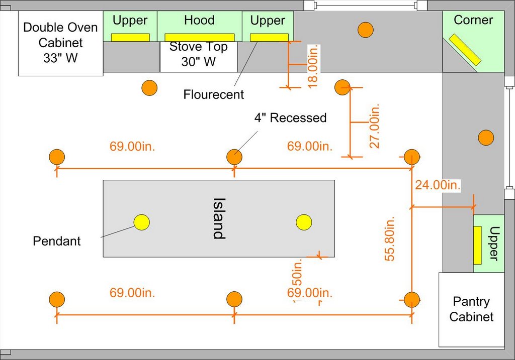
I finally decided on the lighting plan.

After looking at way too many web sites, I gathered enough information to put it together. I guess I could have just looked at a few kitchen pictures, but I wanted to create it from design rules. I found there are a lot of differing opinions on what those "rules" are.

Here is the plan using 5" recessed and T5 flourecents. (the 4" note should be 5")


These are the "rules" I came up with:

Recessed lighting:

  • Use 4" for task areas only - these are expensive and the trim options are limited
  • Use 5" for general lighting if the room is smaller in size or has less than 9 ft ceilings. We went with these.
  • Use 6" for larger rooms with higher ceilings
  • The size of the can does not indicated how much light you will get - the wattage of the bulb does.
  • In general, you need between 2.5 to 3 watts of light per square foot. Here is the math for our kitchen:

11 x 17 = 189 sq ft

189 sf * 2.75 watts per sf = 561 watts (between 2.5 and 3)

514 watts / 65 watt bulbs = 7.9 bulbs --> 8 lights in the ceiling

  • You should set up the parimeter lighting about 18 inches from the upper cabinets

Under cabinet:

  • Mount the lights close to front of the cabinet
  • Lots of options, went with flourecent due to heat of halogen or xenon

Saturday, November 18, 2006

Granite layout, cutting, gluing, testing...

I needed to take a quick break from the cabinets to get a few cut pieces over to the fabricator to put finshed edges on them. These are for the drop-in sink and the island. Delivery time is about 3 days, and I would really like to have them before the Thanksgiving weekend.


Here is the granite layout plan:


I decided not to try to cut the large tiles on my tile saw - it's too risky. The granite between the blade and the fence would likely crack. At $66 a piece I really didn't want that to happen. I bought a 4" skill saw for tile from HD for $45 (Workforce THD250). The saw worked great - really clean cuts. I cut the sink pieces 1/4 large and then re-cut them on my tile table saw, to get them exact.

I am planning in using polyurathane glue to install the granite. I have used it on tile and slate, and it worked really well. I have installed a fair amount of tile and lots of brick and stone (used to work in masonry), so working with morter and thinset is not an issue. I want to bond the granite directly to the wood, so I dont have to add the 1/2 thickness needed for backerboard and two layers of morter. Also, the poly will bond the granite diretly to the undermount sink, and give good water proof seal. Finally, the poly has an "open time" of at least an hour, giving me the chance to make sure everything is exactly right.

So I did a couple of tests... I bought some cheap pink granite and setup prototypes (yup, I'm an engineer). I tested the bonding strength of granite to plywood and granite edging.


Both work excellent.

I spread the glue on about 1" lines on the plywood. This glue foams up, so it needs some place to go, or it will raise the tile. I let it dry about 8 hours. I broke off the granite edge with a hammer both in the upward and downward directions. In both cases it broke at the glue line - in other words, the glue bond is stronger than the granite itself.

For the edge glue, I tried to break it by hand - no go. I can't break it. I have done a lot of edge bonding like this with thinset - it breaks pretty easily. This is definately a superior bond. I am going to back-up the edge bonding with a piece 3/4 x 1 wood, glued in place.

I will bond the edging to the tile before install. This way I can get them exactly right, and not depend on the face of the cabinet to align them. If you notice a poor tile job, it often is due to the front edging not being quite right.
Friday, October 06, 2006

Back at it

Life is what happens when you are planning what you are going to do next: Two trips out of town for work and getting sick put a temporary stop on the kitchen. I haven't been been able to work on the cabinets for a couple of weeks.

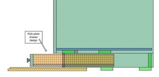
I am looking forward to this weekend. I want to at least get the cabinet boxes complete and the kick-plate drawer assemblies done.

Here is the design for the kick-plate drawers. Basically, the structure will be 2x4 drawer bays with 3 inch drawers. The inset of the drawers will be only 2 inches under the cabinets - so that access will be easy. They will be almost 3 feet wide where possible, so we can store very long items.

Friday, September 22, 2006

Kitchen Floor Plan

I have uploaded the final kitchen floor plan.

The most difficult part of the final plan was the size and exact location of the island.
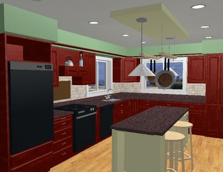
We finally settled on a 30 in wide design. It allows 36 inches on the wall side, 42 inches on the cabinet sides, and enough room to open the in-wall fridge and still have good passage. We should be able to ahve the double-oven, fridge and dishwasher all wide open and still be able to reasonable move around the kitchen.

Friday, August 25, 2006

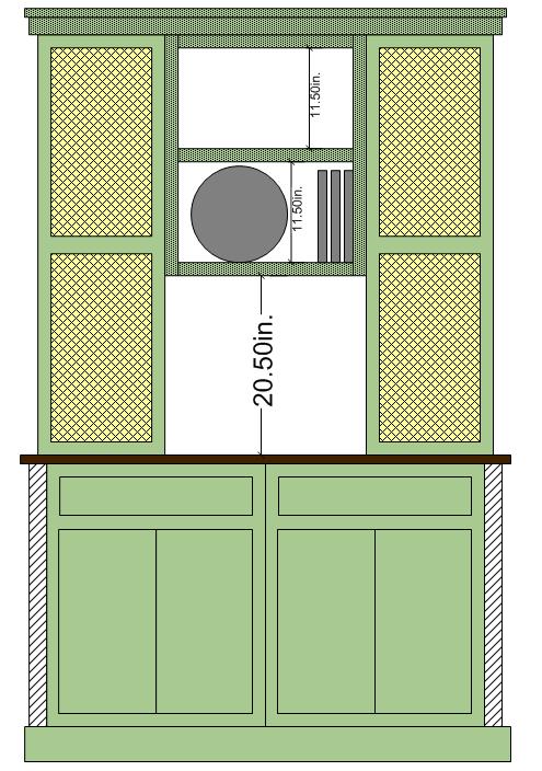
Hutch Design

We decided on the final hutch design.
  • The design mirrors the island
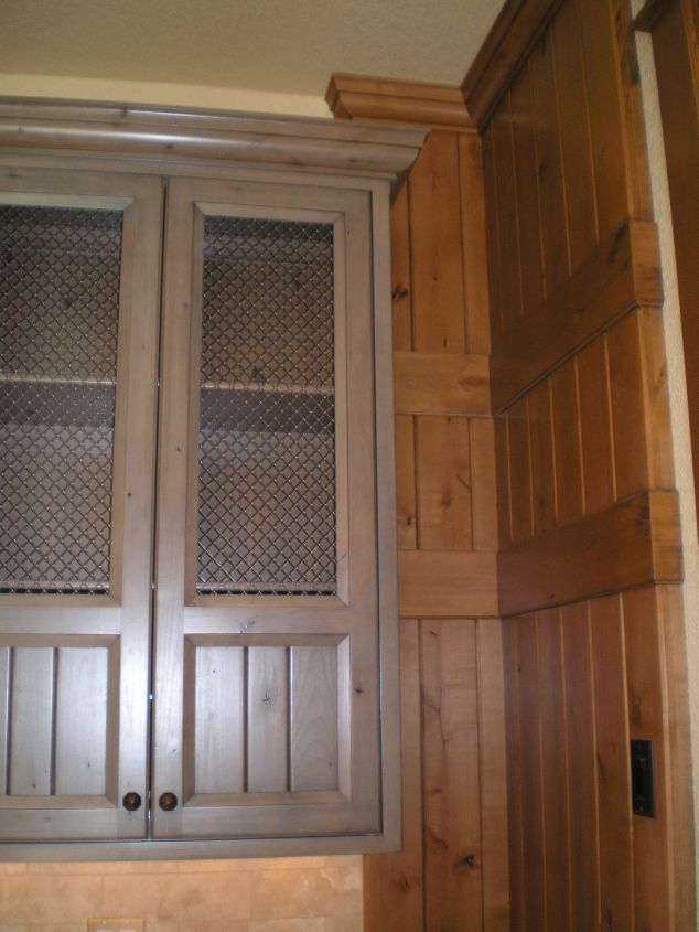
  • The upper cabinets will have pewter screen for panels
  • The center will have open plate racks and bead-board backs

I already have the rough face frame wood cut and the doors purchased. I will assemble the face frames and hopefully cut all the plywood pieces this weekend.
Saturday, August 19, 2006

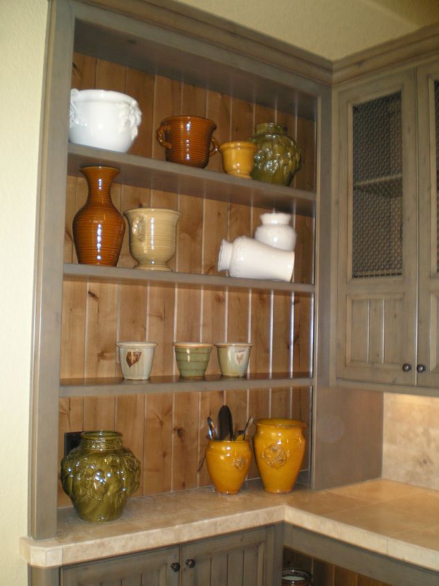
Change the Island and Hutch Color

After the street of dreams tour, we decided to change the color of the hutch and island to green - similar to below. We are also going to put mesh in the upper hutch cabinets.


Sunday, August 13, 2006

Kitchen Design Software

I purchased Better Homes and Gardens Home Designer Suite 6.0 for $99 at Fry's (same price on line). I have used Punch and Visio - this package seems to be much better. It takes a little bit of time to figure it out, but once you get it, you can do a lot. Here is an updated picture of the design.


This has been really helpful for my DW and I to make deicisions. It gives us a better understanding of just how things are going to look. Part of keeping the remodel to $10K is not making any major mistakes...

Wednesday, August 09, 2006

Island Design

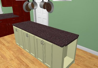
Here is the final island design...


Layout:

Rendered image:


Details:

  • 30 inches wide x 90 inches long
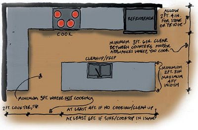
  • 42 inch clearance to counter with range, 36 inch clearance to the wall on the other side
  • Oak and alder wood, painted off-white and then glazed to antique
  • Bead board for the interiors, backs of cabinets
  • Spot for two stool
  • Applicance lift
  • All pull-shelves
  • Display shelf on the end toward the dining area

I used the following diagram for clearances. I found it posted on the Fine Homebuilding web site.
Wednesday, July 26, 2006

Remodeling cost averages

Based on the information below, I am estimating $50K at a minimum if we had the kitchen done by a contractor.

Key cost elements:
  • Kitchen / dining room is 11 x 17 sq ft
  • New lighting
  • Maple flooring
  • 39 feet of custom cabinets - all with top-end hardware
  • Granite counter tops
  • All new appliances
  • High-end sink and fixtures
  • Tile backsplash


Major Kitchen Remodel - $86K

Update outmoded 200 square foot kitchen with 30 linear feet of top of the line custom cherry cabinets with built-in sliding shelves and other interior accessories. Include stone countertops with imported ceramic or glass tile backsplash, built-in refrigerator, cooktop, and 36 inch commercial grade range and vent hood, built-in warming drawer, trash compactor, and built-in combination microwave and convection oven. Install high-end undermount sink with designer faucets, and built-in water filtration system. Add new general and task lighting including low-voltage under cabinet lights. Install cork flooring with cherry trim.


Minor Kitchen Remodel - $16K

In a functional but dated 200 square foot kitchen with 30
countertops, leave cabinet boxes in place but replace fronts with new raised-panel wood
wall oven and cooktop with new energy-efficient models. Replace laminate countertops and
faucet. Repaint trim, add wall covering, and remove and replace resilient flooring.


MAJOR KITCHEN REMODEL - $43K

Update an outmoded 200-square-foot kitchen with new cabinets, laminate countertops, and standard double-tub stainless-steel sink with standard single-lever faucet. Include energy-efficient wall oven, cooktop, ventilation system, built-in microwave, dishwasher, and garbage
disposer. Add custom lighting and new resilient floor. Finish with painted walls, trim, and ceiling. Include 30 linear feet of semi-custom grade wood cabinets, including a 3-by-5-foot island.